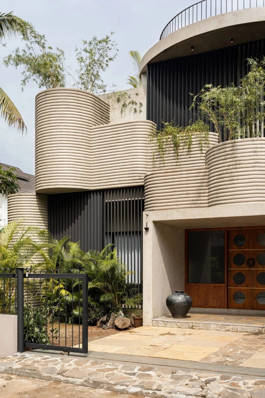
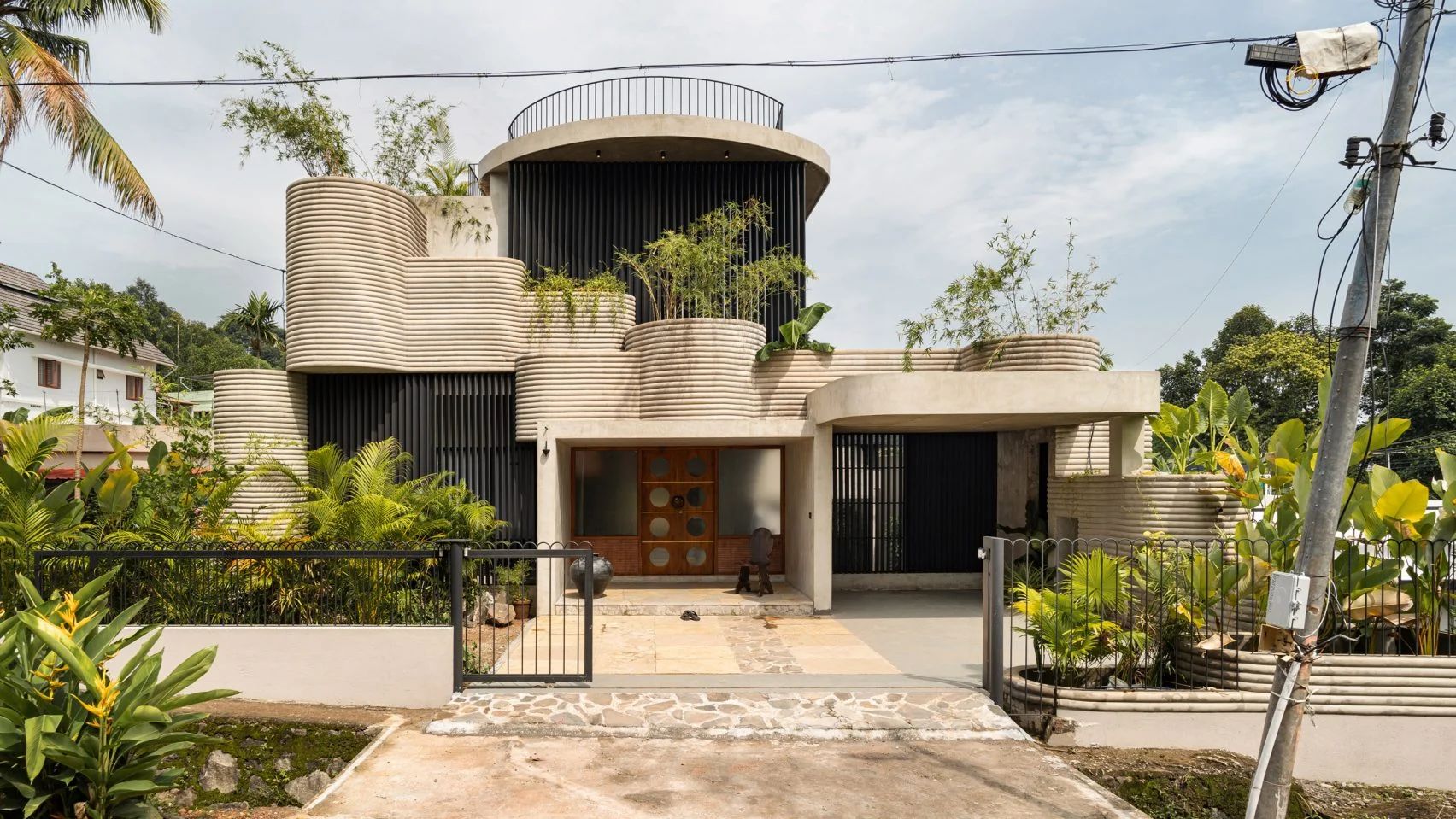
In this week’s comments update, readers are discussing a home in Kerala with curved walls formed of smooth layers of cement plaster, designed by local studio Tropical Architecture Bureau.
Informed by the architecture of tropical modernism, the home is organised around a series of internal courtyards and planters.

“This is totally wild!”
“Certainly no order and method here,” observed Tom Roberts before concluding “it is all over the place”.
For Marius, “not all the spices from the rack, even if they are expensive, should be thrown in the pot”.
I M Slei exclaimed “this it totally wild! And a bit too cold for my tastes”. They went on to ask “were the walls ‘printed’ with BIG’s lavacrete 3D printer?”
They weren’t the only reader posing the question. “Was the plaster/concrete done with a giant 3D printer?” wondered Keith Powers.
Meanwhile, JuzzbeanSillé had a different query, asking “is it cake?”
Commenter BrettS was a fan of the dwelling, saying “interesting things happening”. Henry also granted that “as far as ‘rich person’ houses go, this is a good one”.
What are your thoughts on the Kerala home? Join the discussion ›

“At last, designs to make folk feel happy”
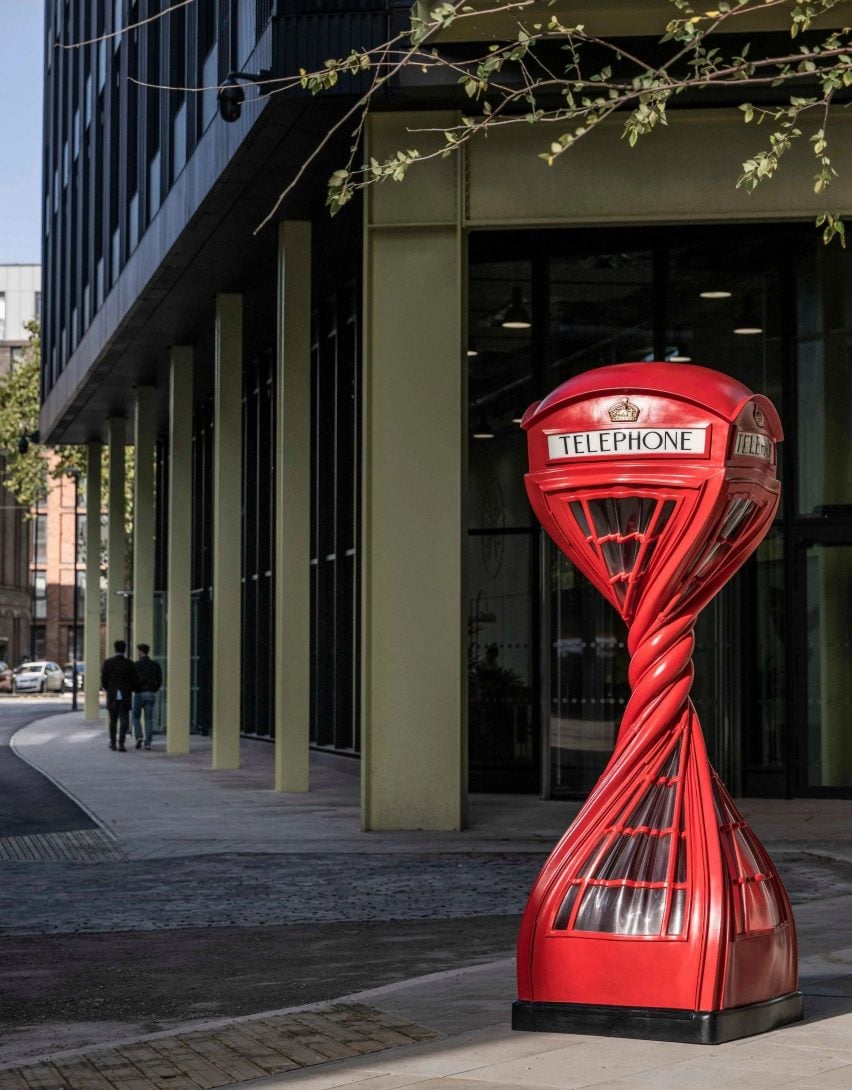
Readers were also reacting to a series of sculptures in Bristol created by British artist Alex Chinneck including a twisted telephone booth and knotted lampposts.
Commenters were largely impressed. “Amazing – I’d love to see these pop up elsewhere in the country,” wrote Gothic Gargoyle.
Ghost of Mike Brady agreed – “come on, how can you not like these?” they asked. “Imagine a child’s reaction to them”.
“At last, designs to make folk feel happy” commended Richard Porteous. “Bravo!” they added.
However, Operacreep was less impressed, writing “the usual trite visual jokes presented as sculpture… perfect for decorating a developer’s underwhelming quasi-public space.”
Let’s call it new corporate art and be done with it,” they said.
What do you think? Join the discussion ›

“A far more successful Vessel”
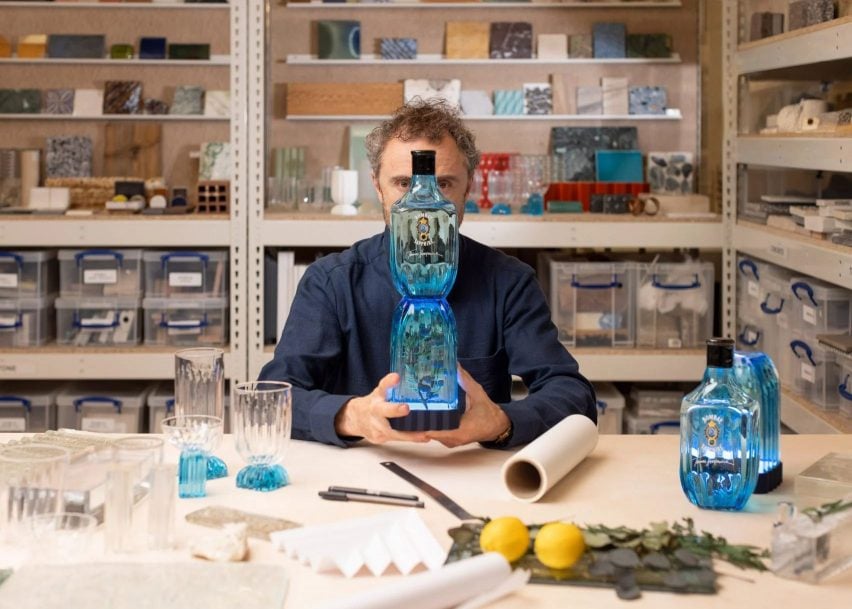
Another design story stoking plenty of debate in the comments section this week was about Thomas Heatherwick creating a collection of sculptural bottles as part of his glassware collection for Bombay Sapphire.
Commenters likened Heatherwick’s design to various household cleaning products.
RK thought the design had the “same energy” as a washing-up liquid bottle, while Octavia Furquart responded “I’ll see your washing-up liquid with a 1980s Domestos bottle”.
Meanwhile, I M Pei suggested it “looks like his latest plans for that shopping centre in Seoul”.
JZ also referenced another one of Heatherwicks architecture projects, calling the bottle “a far more successful Vessel.
Commenter Dixie Normous wasn’t convinced, proposing “just feels a bit big no?”. They deemed it to be “like a big bottle of fizzy drink rather than a delicate floral bottle”.
Are you a fan of Heatherwick’s latest design? Join the discussion ›
Comments Update
Dezeen is the world’s most commented architecture and design magazine, receiving thousands of comments each month from readers. Keep up to date on the latest discussions on our comments page and subscribe to our weekly Debate newsletter, where we feature the best reader comments from stories in the last seven days.

