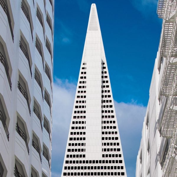
UK studio Foster + Partners has renovated the modernist Transamerica Pyramid skyscraper in San Francisco, USA, restoring elements from the original design and linking it to a redesigned adjacent park.
Foster + Partners renovated the 853-foot-tall (260-metre) office skyscraper, which is the the second tallest building in San Francisco, for developer SHVO by opening up the lobby, refreshing amenities and implementing landscaping strategies to better connect the iconic building to the streetscape.
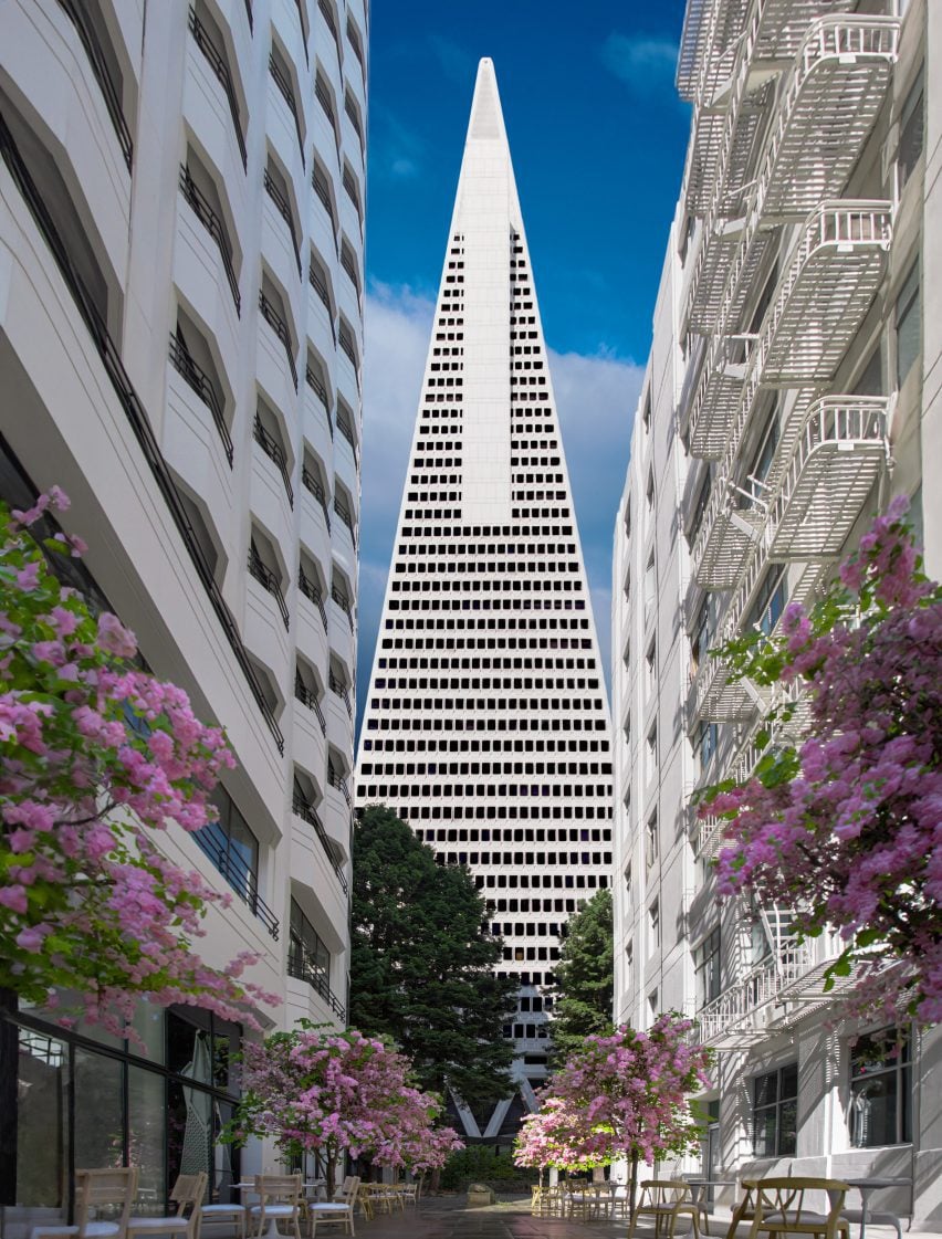
Originally designed by William L Pereira & Associates and completed in 1972, the landmark skyscraper has quartz-studded concrete facades with punch windows and a base that flares outward with massive trusses towards the street.
While the structural systems and the facade of the skyscraper were left relatively intact, the architecture studio wanted to open up the lobby and amenity areas to reveal the structural elements.
“Since Pereira’s original conception in 1972, our work on the Transamerica Pyramid has revitalized the building, clearing away years of later additions that had compromised the space internally,” Foster + Partners head of studio David Summerfield told Dezeen.
“The new masterplan restores the logic of Pereira’s plan, reasserting its clarity and revitalising the ground plane.”
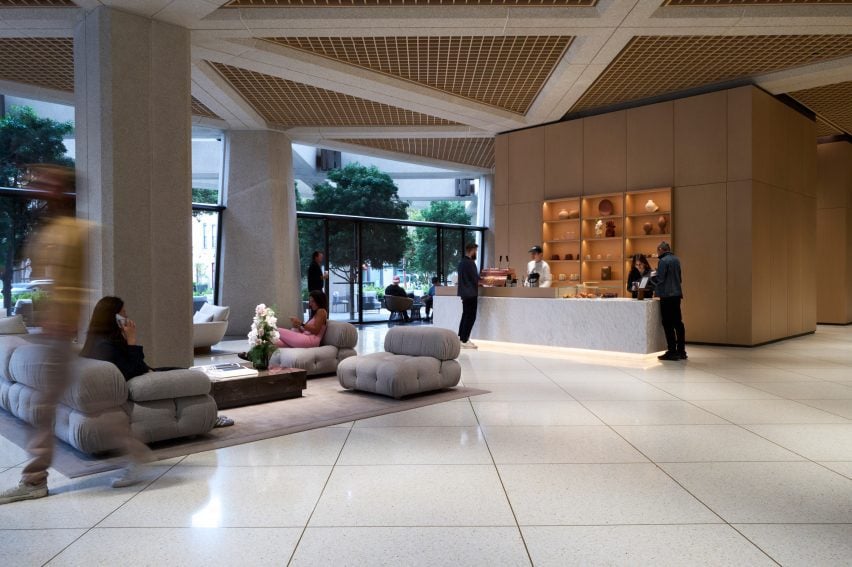
The primary intervention in the lobby was the removal of a ceiling that had been installed, hiding the gridded structural concrete above.
According to Summerfield, the team looked back at the original blueprints to understand the structural elements that were hidden by the ceiling.
“The new design takes its cue from the Transamerica Pyramid’s unique structural geometry and scale, carefully restoring the historic lobby, celebrating the original architecture by exposing the beams and structural cross-bracing in the arrival area and bringing the existing iconic colonnade inside,” said Summerfield.
“This structure has been revealed and clad to match the building’s exterior, creating a seamless transition between inside and outside.”
Due the expansion up and out and the addition of glass skylights, the original height of the lobby was achieved and more connections to the urban surroundings and the adjacent park were established.
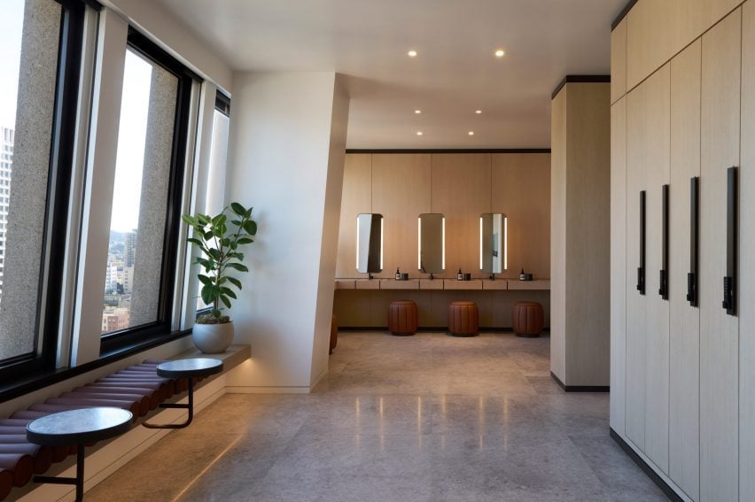
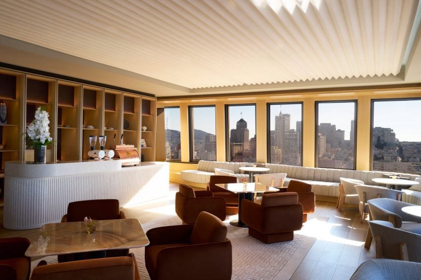
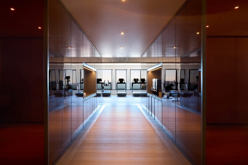
Many of the higher levels of the building contain offices and will be redeveloped based on the needs of the tenants, while a series of private fitness areas and lounges have been remodelled.
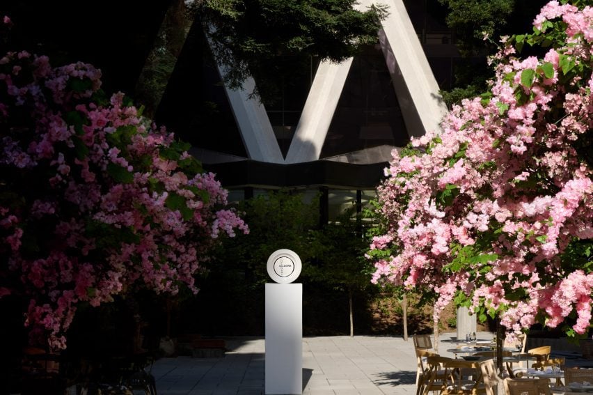
At the rear of the building, Transamerica Redwood Park was updated with a smaller annexe building, which has a pyramidal roof, turned into a cafe.
The park features dozens of mature Redwood trees, and Foster + Partners added additional landscaping, especially at the perimeter to open up the space to the public.
At the back of the block, past the park, are two buildings with an alley between them. Called Mark Twain Alley, it has also been restored and small plantings added to create a promenade with shops leading to the park and ultimately the skyscraper.
These buildings were also purchased by SHVO and will be redeveloped in the next round of construction.
Founder Michael Shvo told Dezeen that the building “symbolized the American dream” when he visited it as a child.
“It was important that this building became a communal center, as much as a great office building,” said Shvo.
In order to further a community-oriented program, the developers have also instituted an arts program that will display rotating exhibitions and sculptures in the park.
Other renovations of iconic buildings include Detroit’s Book Tower by ODA and SOM’s revamp of its original design for the Lever House skyscraper in New York.
The photography is by David Lipman

