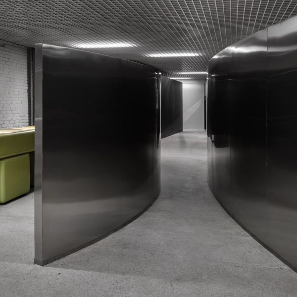
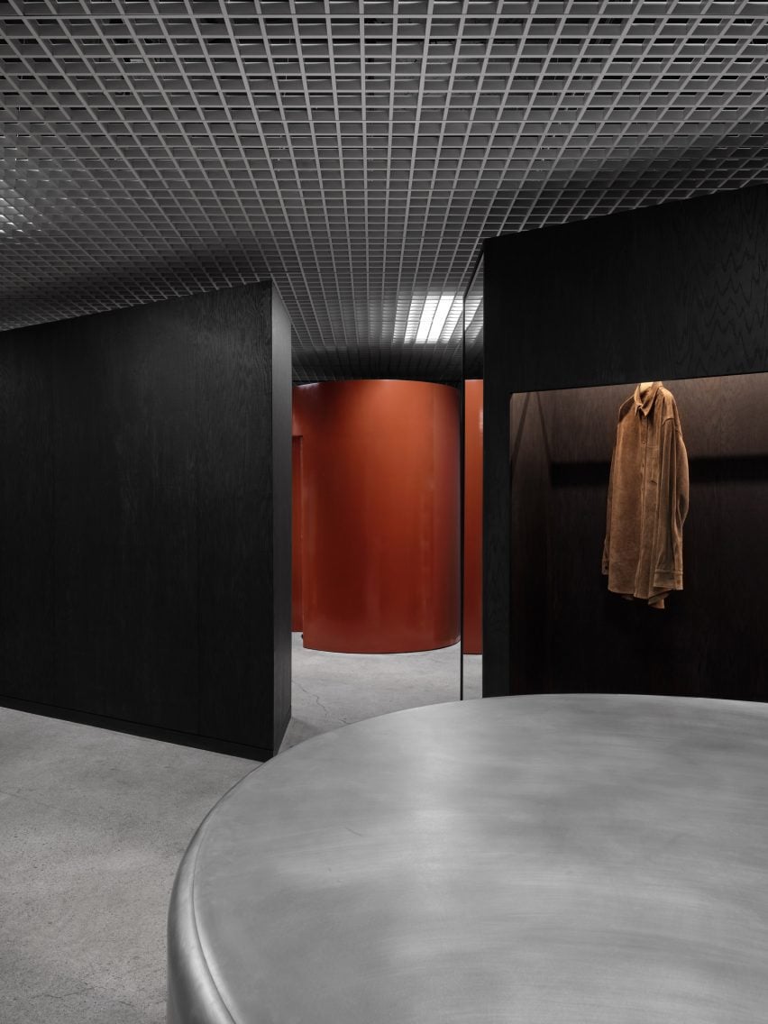
Los Angeles-based studio 22RE has combined metal grids, black and mirrored surfaces, and bold splashes of colour inside this men’s multi-brand boutique in the city’s Arts District.
The second Departamento location is situated in the Signal retail enclave, which occupies a series of warehouses southeast of Downtown LA.
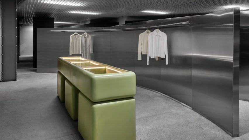
Using the building‘s industrial bones to inform design decisions, 22RE took styling sensibilities of 20th-century modernists like Rudolph Schindler and Richard Neutra.
“Inside, 22RE leans into the original architecture’s industrial elements through a deconstructivist lens,” said the studio.
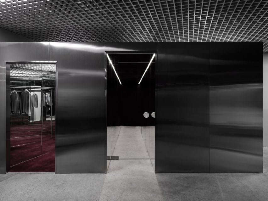
The store’s entrance is concealed inside a Concierge Coffee, leading to a mirrored portal that opens onto the shop floor.
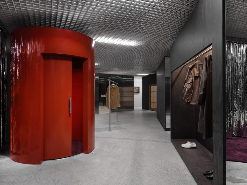
While the layout follows a typical grid, the designers have inserted a variety of partitions, volumes and displays that “disrupt” the flow and encourage shoppers to explore.
“This non-linear layout challenges the traditional browsing experience and provides an unconventional yet effective approach to shopping,” said 22RE.
A pair of curved metal-clad walls that evoke a Richard Serra sculpture form a narrow corridor from one area to another, while also displaying garments on their concave sides.
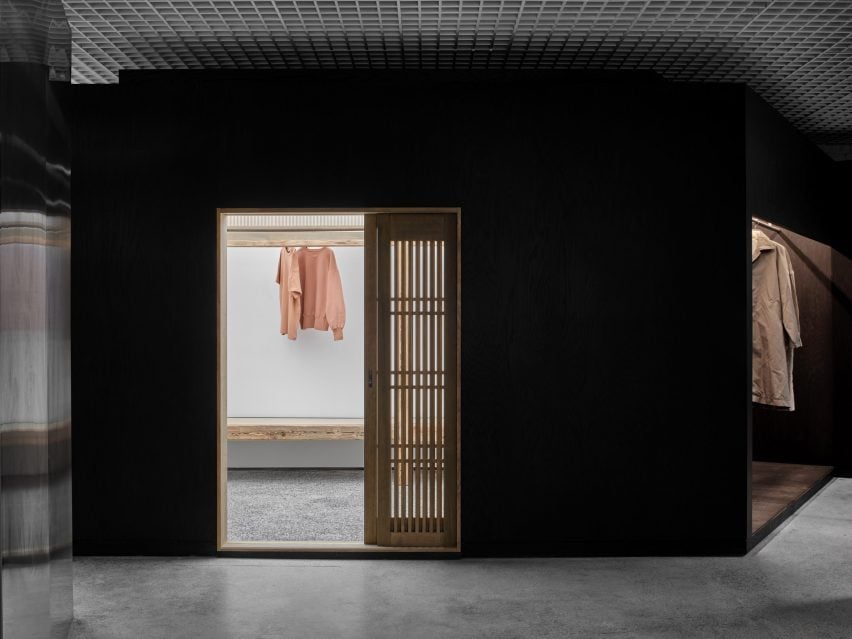
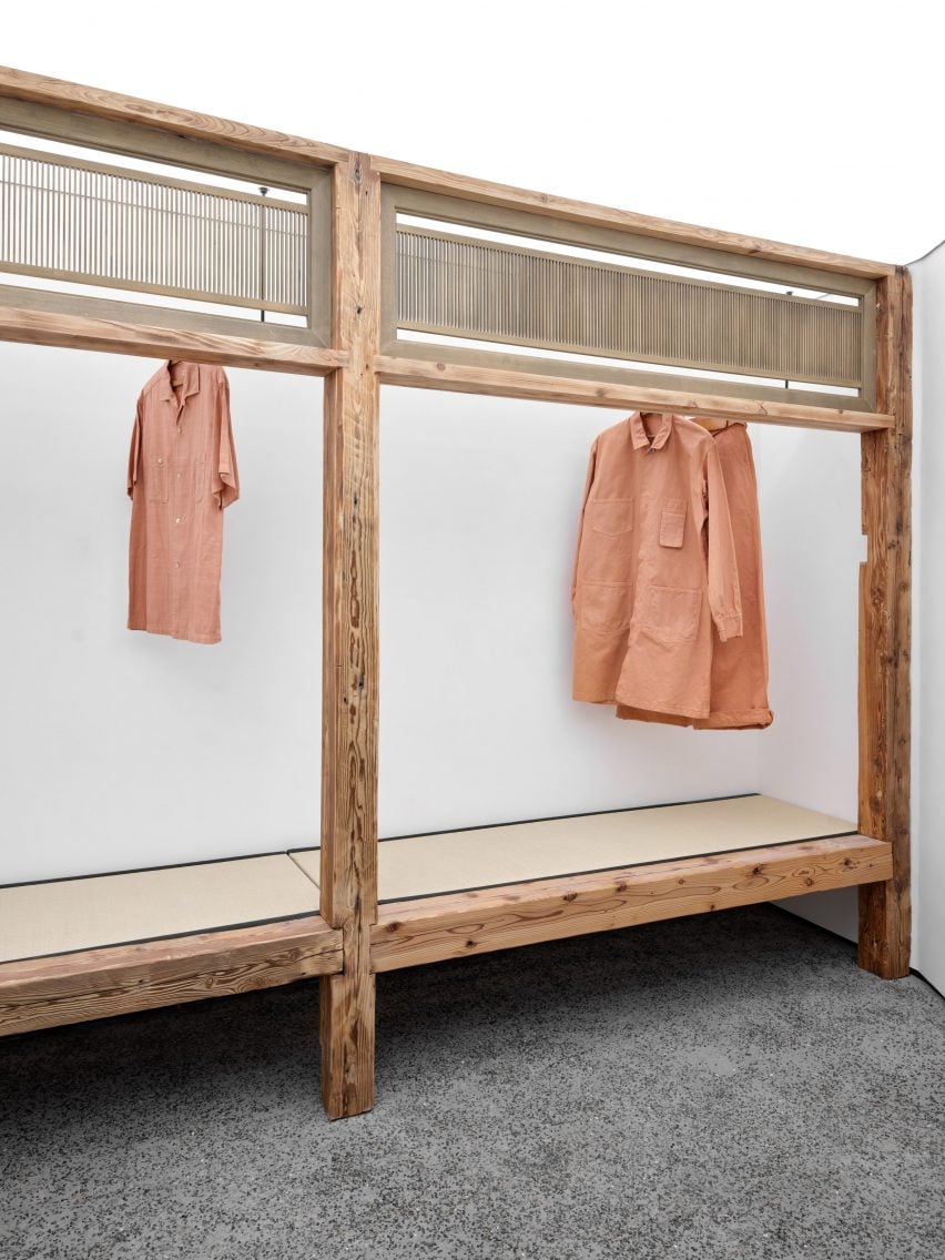
Blackened wood panels form an enclosed space, inside which bright white walls and repurposed wooden framing contrast dramatically with the rest of the store interior.
“The space, entered via a slatted, sliding door, invites guests to experience the collection in a ryokan-inspired setting, evoking the traditional Japanese inn,” said 22RE.
This shop-in-shop was designed in collaboration with fashion brand Taiga Takahashi, and also features shelving made from tatami mats and flooring intended to resemble pebble stones.
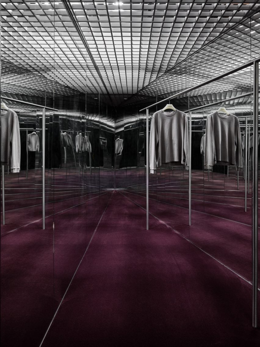
Another triangular niche features mirrored walls that create infinite reflections of the apparel and the aubergine-coloured carpet on the floor.
“Collections are hung and displayed via monolithic and sculpturesque forms that divide up the space, creating a fluid but juxtaposing dichotomy between the heavier wood forms and the lighter metallic elements,” 22RE said.
A red cylindrical volume is used as a fitting room, while further dressing areas are tucked away behind silver curtains.
Custom elements include a green fibreglass resin-and-foam jewellery case and a chiselled aluminium side table.
A white aluminium ceiling grid stretches across the entire store, extending over all of the freestanding elements, with lighting embedded behind creating futuristic glowing patches.
22RE was founded by principal Dean Levin in 2021, and has since completed a range of interior design projects across the US.
The studio recently wrapped up the offices for a creative music agency in LA that include a 1970s-style sunken meeting room and a golf clothing boutique in Miami lined with pale-green stucco.
The photography is by Erik Stackpole Undehn.

